

In 2013 I led the complete redesign of the Audible.com home page for registered users.
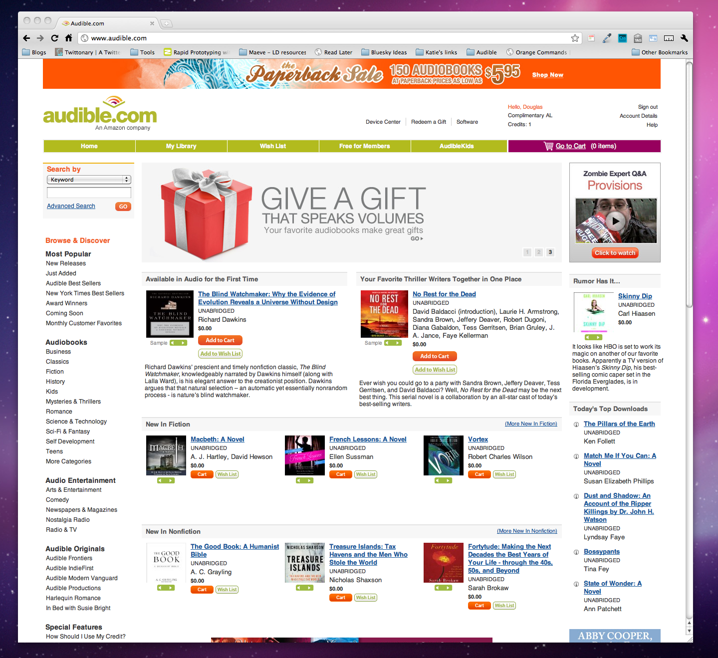
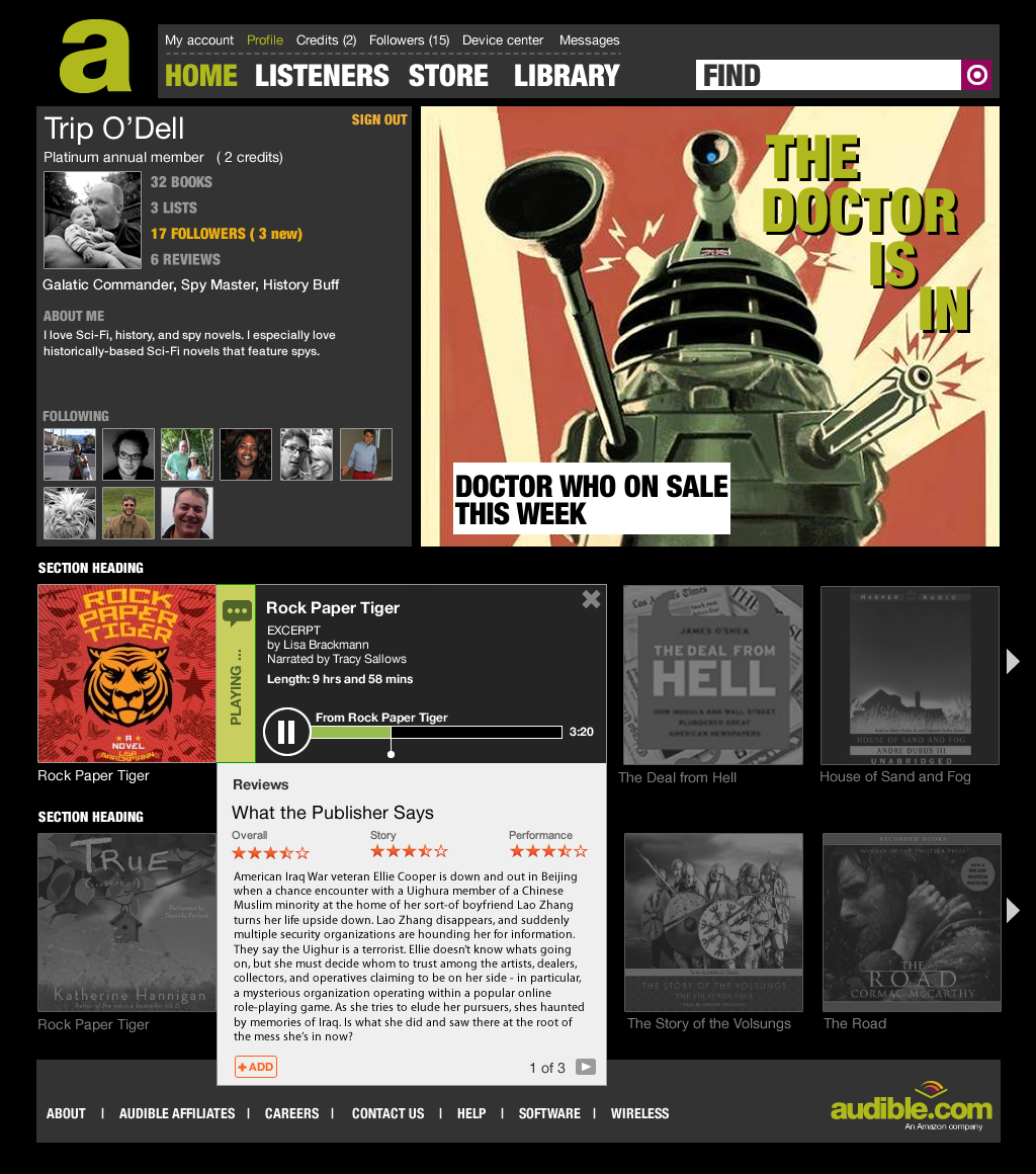
Aside from a redesign of the site's navigational structure in 2012, the main home page of the website had not seen a significant rework of the user experience since the company's acquisition by Amazon in 2008.
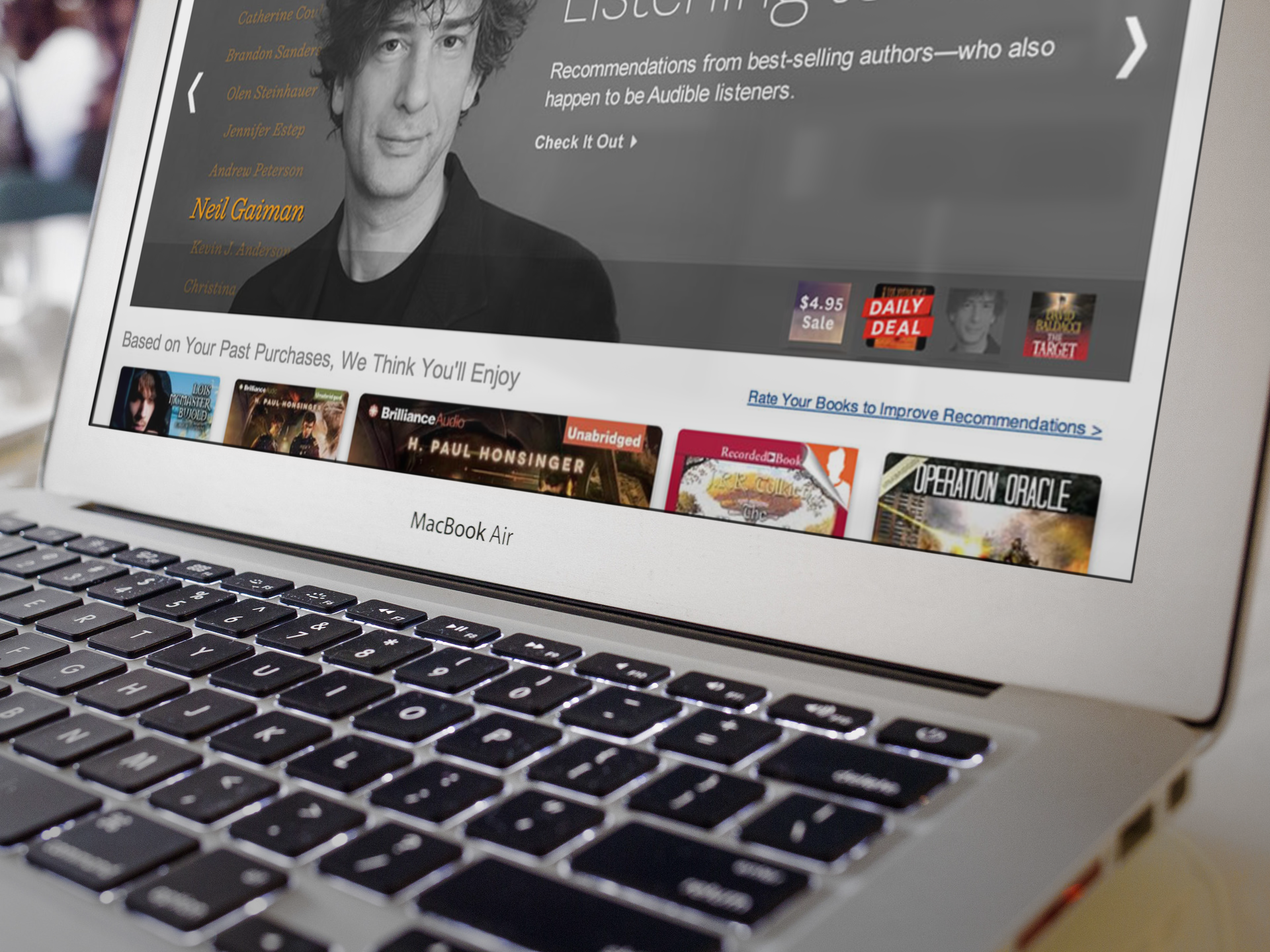
Despite Audible's popularity with its subscribers and long-time customers, the existing Audible website was an eyesore, desperately in need of an overhaul.
I had worked on many features for the website over the past years, but the updates were almost entirely functional, and despite our best efforts to address serious shortcomings in the UX and visual presentation, we never had the opportunity to address core issues systemically.
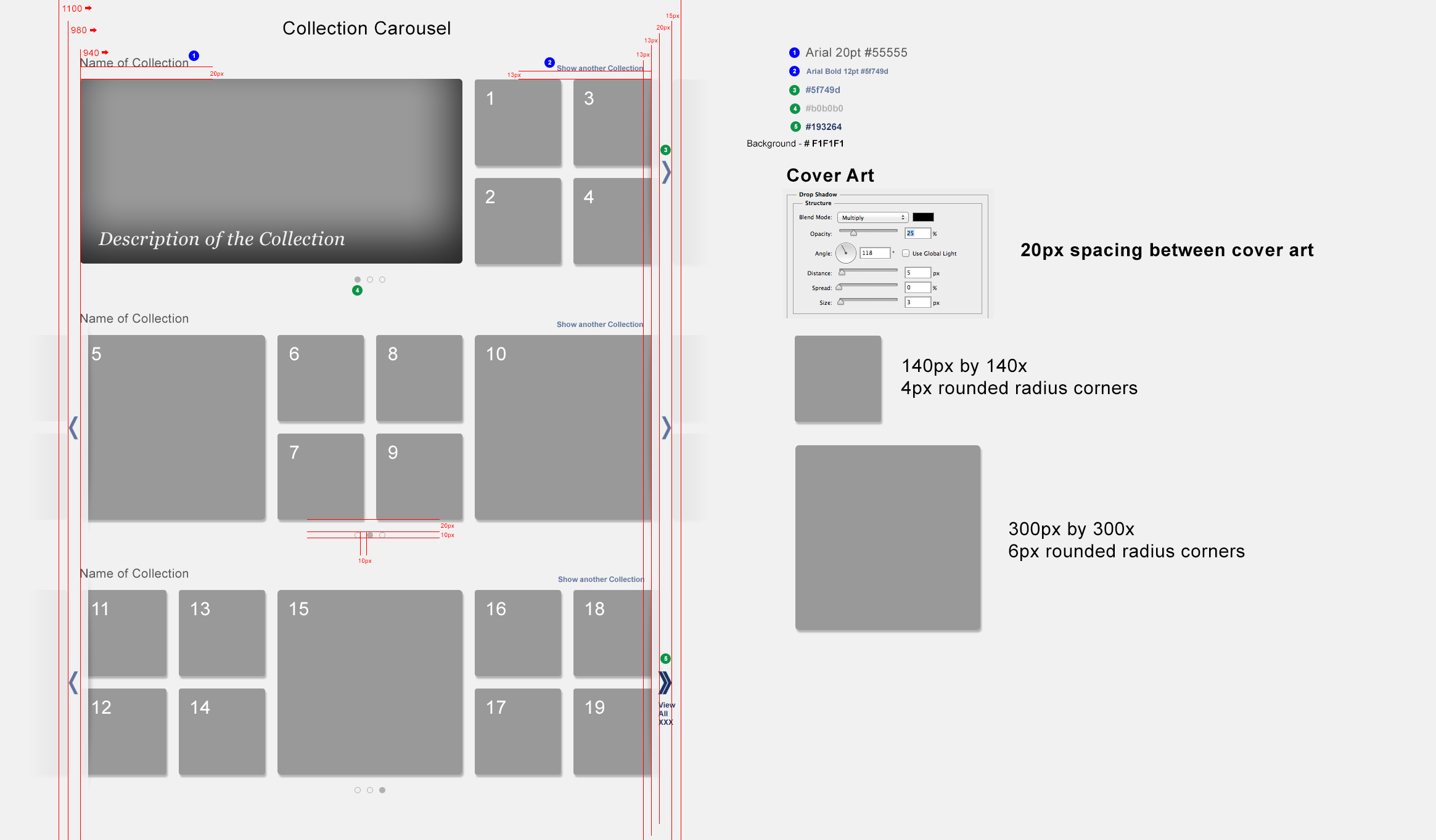
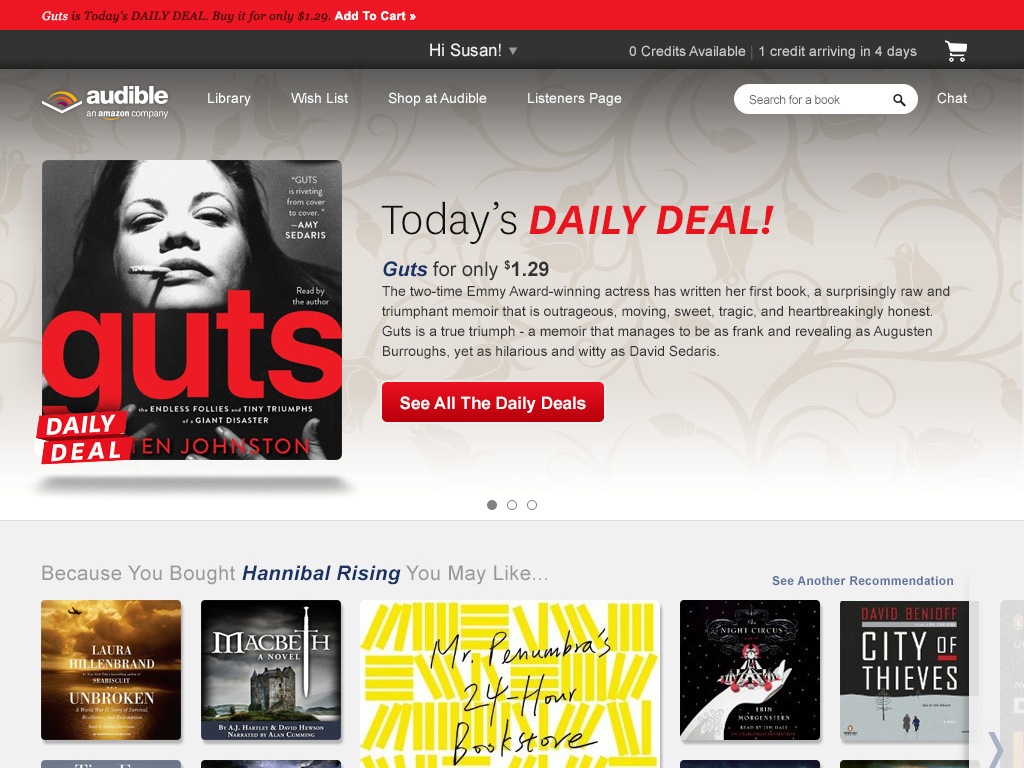
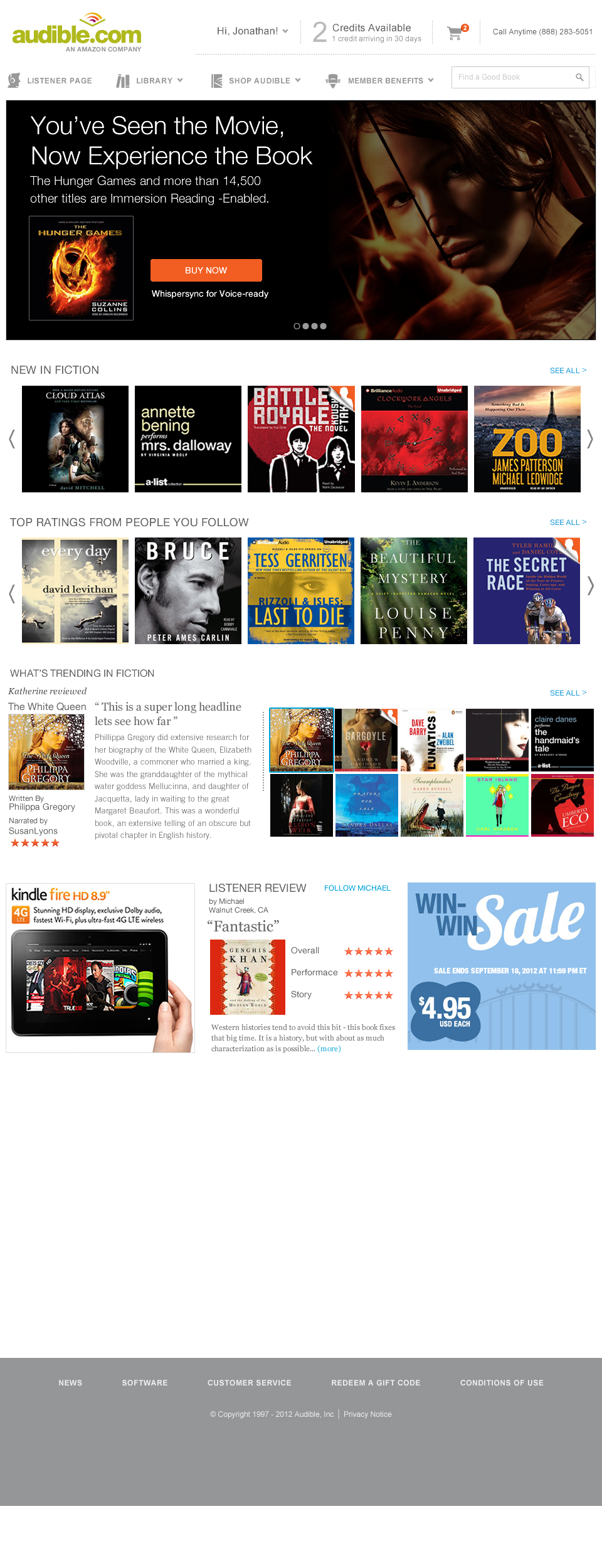
Last year's redesign (launched early in 2014) represented a complete departure from the past, and introduced a variety of new features including recommendations based on past purchasing across Amazon services.
The new design embraced a "content first" approach by celebrating the cover art and eliminating extraneous metadata and noise on the page.
The philosophy driving the change was to celebrate core functionality on the page. For each page to be "great at something", a design tenet I borrowed from my years at Microsoft.
The results were compelling, both for the experience, as well as for the business. The new page and features accounted for massive improvements in key metrics - including 400bp improvement in click through to product details, reduction in search traffic, higher revenue per visitor, higher organic conversions to membership, decreased bounce rates and 67% percent of user feedback, from more than 1000 respondents was rated as "extremely positive".