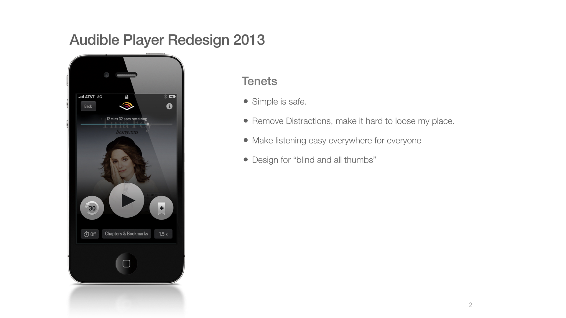
The Audible Player Redesign 2013
Listening behind the wheel is a primary use case for many Audible customers.
In 2012, Product leadership tasked me with designing "car mode" for our listening apps. The early research on distracted driving and smartphones was becoming major news, and leadership at Audible were concerned about how customers were using our apps.
Bluetooth was still mostly in its early adopter stage, and most users either connected their app to the car via an AUX cable or used earbuds while driving.
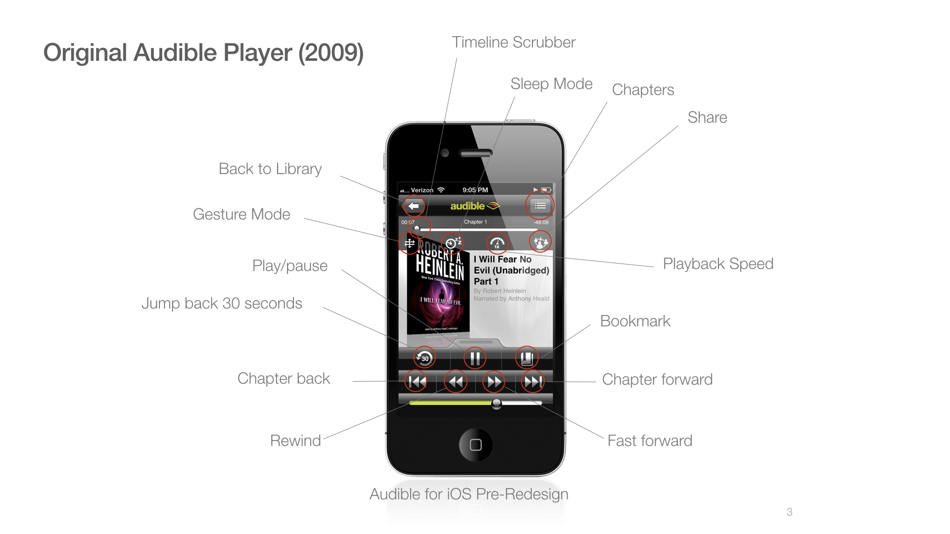
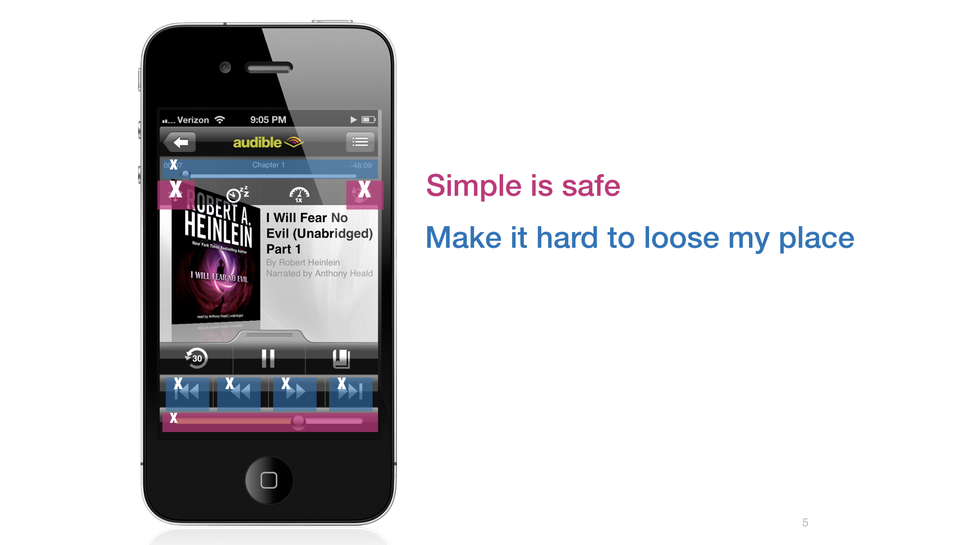
The Audible app was very "feature rich" at the time. It already had many modes and views. It had lots of controls that allowed the user to scrub the book, skip chapters, fast forward, rewind, jump ahead and back 30 seconds. It was a very dense interface.
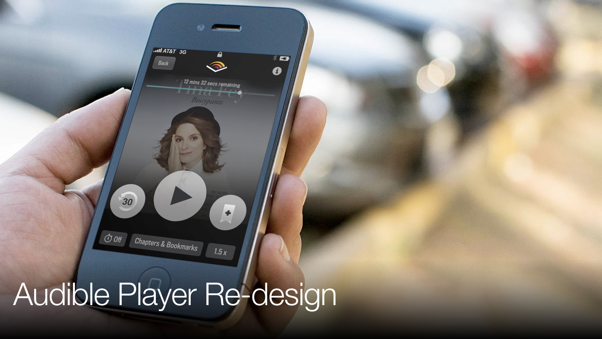
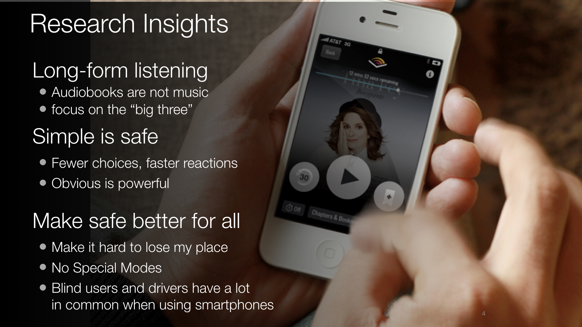
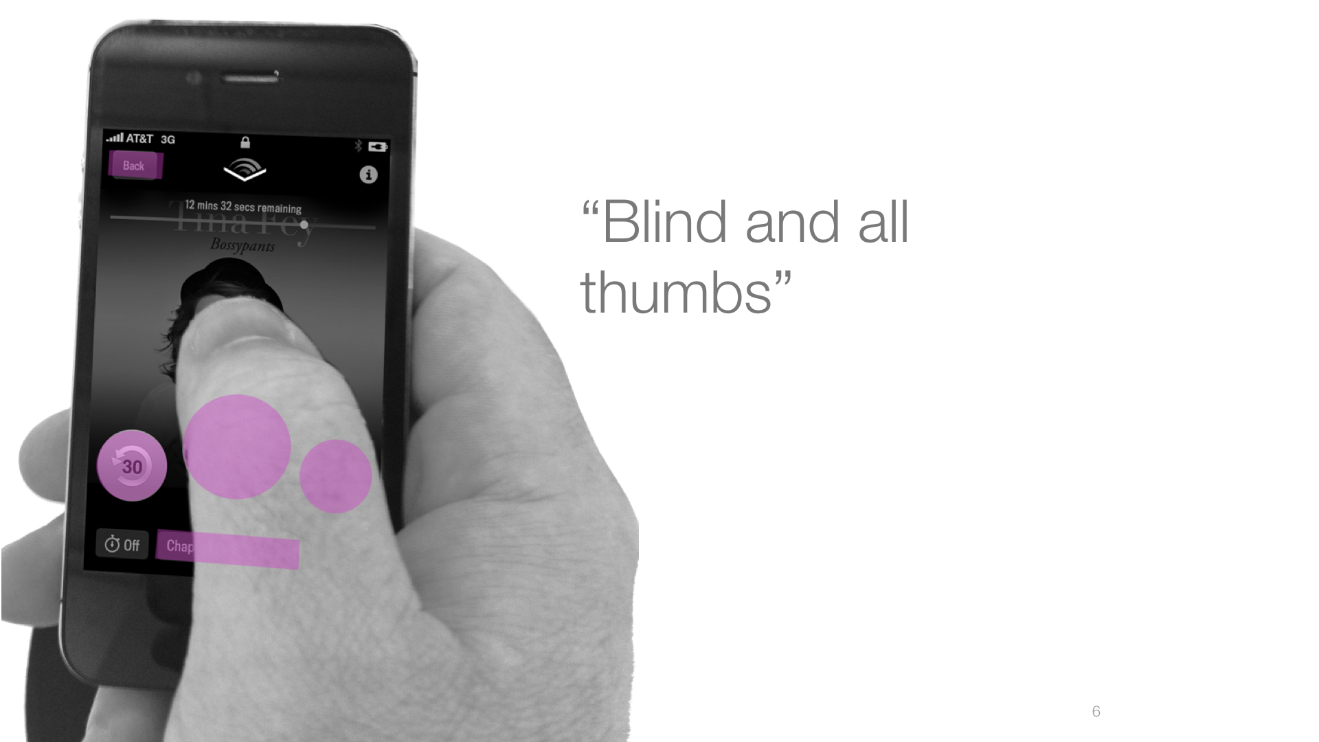
Ironically, most users utilized three buttons most of the time: Play/Pause, Jump Back and bookmark. Users bookmarked their place because it was too easy to "fat-finger" another button and lose your playback position, which required a lot of work to find again.
I was tasked to "Redesign the car mode," which seemed like the wrong direction because it was yet another button that required users explicitly made the right choice to limit their distractions.
I conducted a qualitative study where I did ride-alongs with other employees and watched how they used the app. I would interview them and even added some interruptions like secretly calling their phone while they were listening to see how they dealt with the disruption. It was eye-opening, and frankly a little terrifying.
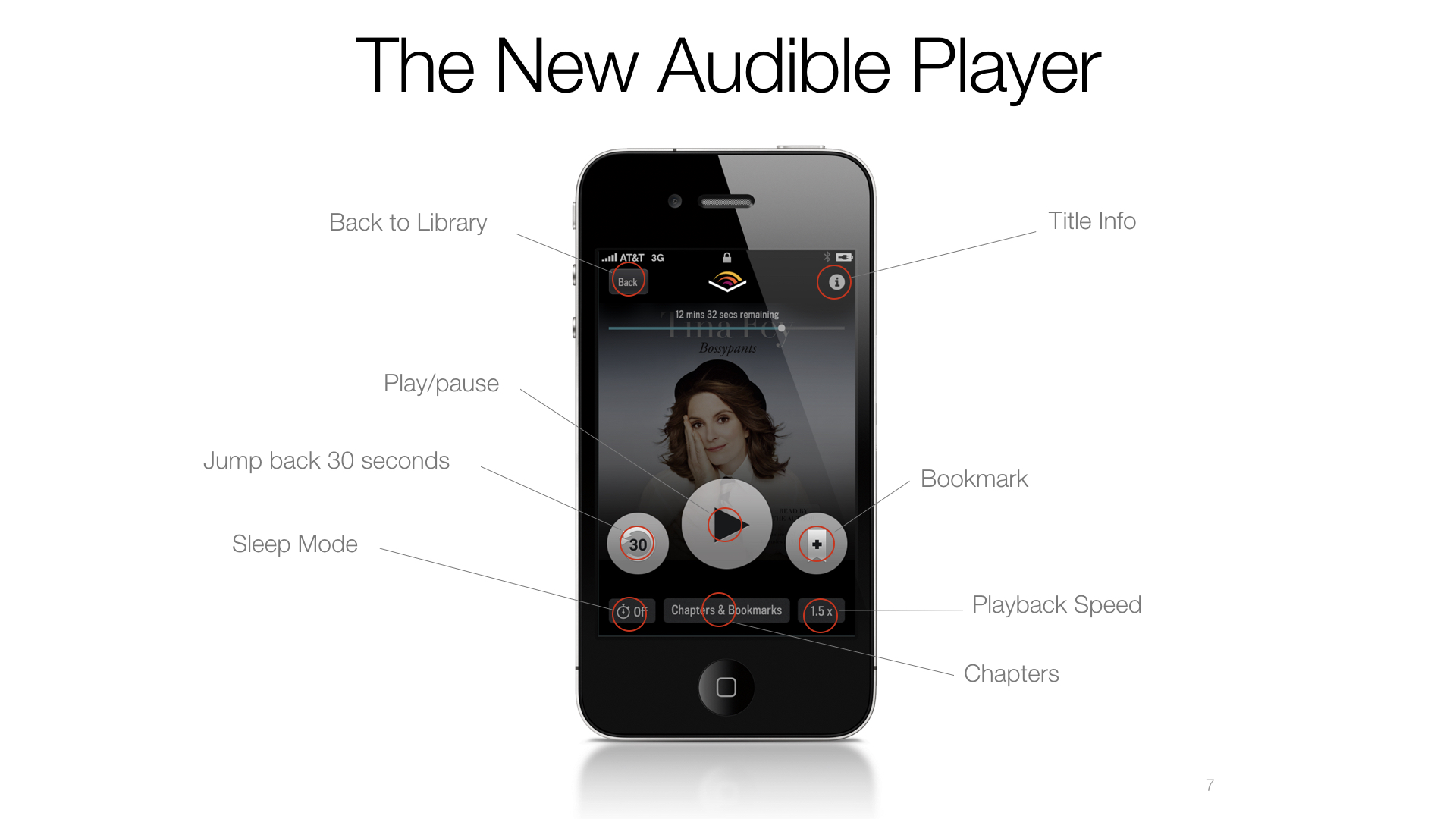
At that point, I took my finding and fought to convince my leadership that a "car mode" was the wrong direction. We needed to make the app easier for everyone, all the time. This was an unpopular direction because it meant "de-featuring" or hiding less frequently used features, but the result was an app that exceeded Audible's historically high App store ratings (once users became familiar with the significant changes).
Most of the interaction pattern changes have remained, unaltered or modestly tweaked from the initial launch.